
Here is another collage of quilts from the Quilt Festival in Houston.
What is your first impression of these quilts?
Bright! But also, what they have in common is the color Orange.
Many of us have been trained not to like the color Orange. We learned that Orange was not a wearable color, and therefore it was a “bad” color. Sometimes these early color prejudices carry over into our artwork and quiltmaking, without us knowing.
However, these fiber artists have clearly harnessed the power of Orange in these pieces. By using complementary color schemes (Orange with Blue) they make the colors pop out. By using secondary color schemes (Orange with Purple and Green) they give their works a very creative and contemporary twist.
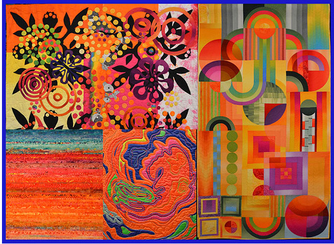
Here are the quiltmakers, starting at the top left and going clockwise:
Mary Ann Herndon – Rio Rosie
(top half of layered applique quilt)
Shirley Gisi – Technicolor Deco
(full quilt with ombre sections)
Betty Hahn – Birth of a Storm
(detail – abstract applique)
Leah Gravells – Look to the West
(detail – string piecing)
There are many ways to attract the eye to a quilt.
Color is of course very effective, but here we also see movement created by abstract swirling shapes, an effect of transparency using ombres, and a shimmering feeling with tight horizontal lines, and depth created by layers of appliques.
If your stash is lacking luscious Oranges, check out some contemporary blenders and beautiful batiks to add some juicy pizzazz to your color palette.
Thursday I am flying to San Diego for the Color Marketing Group‘s International Conference, where we will work together to identify color trends for our respective industries. As always, I’ll be applying what I learn to the fabrics I choose in the coming months, to make sure you can always find the perfect hue for your next project!
Share Post: