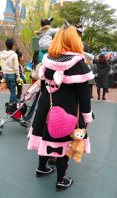
I hate being told what to do, don't you?
As one of the younger Boomers, I come from an era when we still got way too much direction on what colors to wear, when to wear them, which colors were acceptable and which were taboo.
As a young adult this just infuriated me. How dare "they" classify all of us into large herds of women who could only choose apparel from a set palette of colors? The nerve! I made a point of finding out what was my "season" and then avoided those colors for years.
It is true that certain colors will make us look (and feel) better, but it is also true that those colors can change yearly, monthly, even daily. After studying the Psychology of Colors, I realized that I was choosing colors each day based on an intuitive feeling about my state of mind, my physical health, and what I expected for that day. (A stressful day? A romantic day? A creative day?)
I also became fascinated with how the Psychology of Color helped to explain the Mass Consciousness of color trends. As the years went by and I worked in the fashion industry, I saw the patterns emerge that would link certain color trends with the economic, political and cultural swings of the public. How fascinating is that?!
Today we have Redheads wearing Bright Pink, (see my photo above from Tokyo Disneyland, with her creative use of polka dots & pink Minkee!) White being worn after Labor Day, Orange and Yellow being worn by everyone, and lots of other stuffy old color rules being broken without a second thought. Color combinations that strike us as bizarre initially, can grow on us and eventually become our favorites. (Remember the first time you saw turqoise and brown together?)
As quilters, we are subject to the same old unconscious color prejudices. A lot of quilters are more uptight about their quilt color choices, than their fashion color choices! We go to quilt shows and look at quilt magazines, and fall into a sleepy haze of sameness, using colors that are familiar and safe, classic and neutral. That's ok, but after awhile the Creative Quilter starts chomping at the bit and looking around for something that makes a bolder statement.
I believe that if we strip away our expectations and rules, and look at color from our heart, we are drawn to the colors that express the emotions we are feeling, or the emotions we would like to experience. We crave certain colors, the way our bodies crave certain nutrients. Maybe we are not ready to feel a powerful emotion like passion or anger, but we are instinctively drawn to Red because it helps us to access that feeling on a deeper level. Maybe we are craving peace but are unable to "let go", so we bring in the colors of tropical waters to soothe us in the meantime.
Sometimes we arrange a palette of neutrals and add in a "pop" color. Hey, that's ok. Sometimes that is how we have to try out a crazy or dangerous color in a safe way. Then maybe we get brave and try that same pop color with black, or even with the complementary color. Playing with color and auditioning fabrics from your stash can be more fun than making the quilt, because we get to try on different feelings with each color combination.
Here's a create nudge for the next week:
Spend some time with your stash, or with our Color Palette, and see if you can identify a color that you've avoided in the past, but you are attracted to now. Play around with this color with your stash, or on our Design Board. Audition the color with neutrals, then with similar/analogous colors, and finally with crazy contrasting colors. How do the different color combinations make you feel? Is it your head or your gut that disapproves of a particular color pairing? Do you experience a moment of recognition when the perfect combination drops into place, and you catch yourself saying out loud – "Aha!" 
